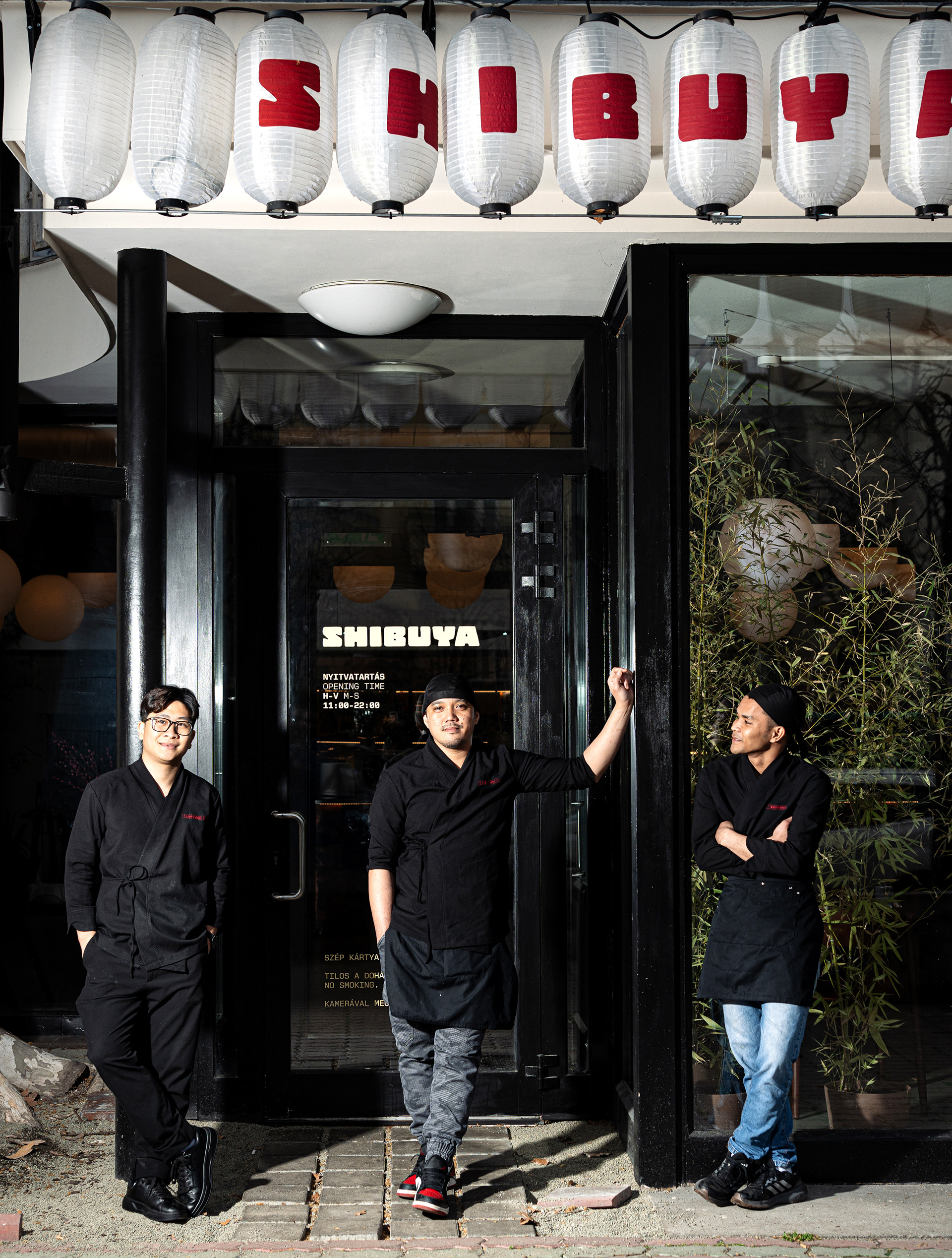
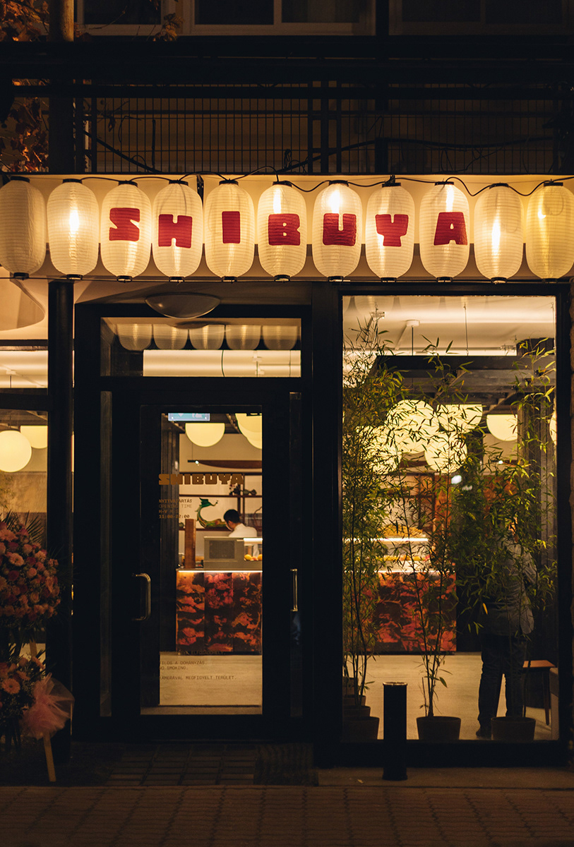
Shibuya Restaurant
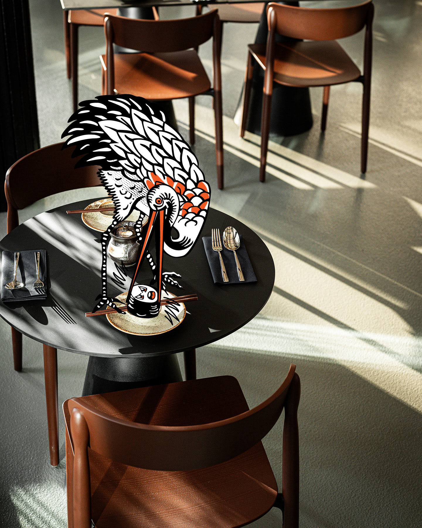
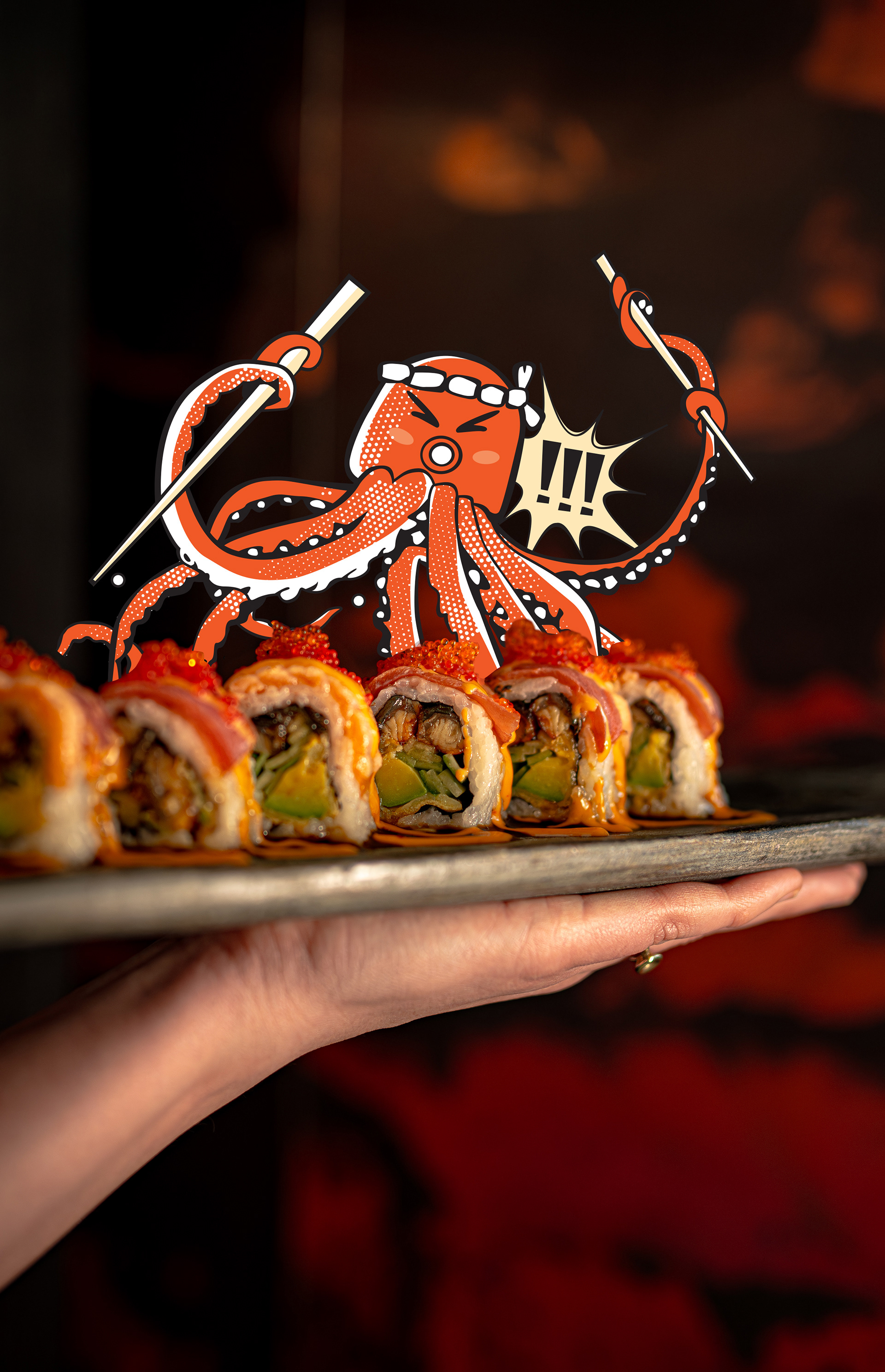
Our task was to developing the branding strategy and handled the visual identity. Shibuya’s visual language is rooted in post-war Japan, a moment when Western modernism collided with traditional Japanese aesthetics, giving rise to an entirely new visual culture. Influenced by European constructivism and 1960s Japanese advertising, this era produced a bold, graphic and often surreal language, that later evolving into manga and anime.
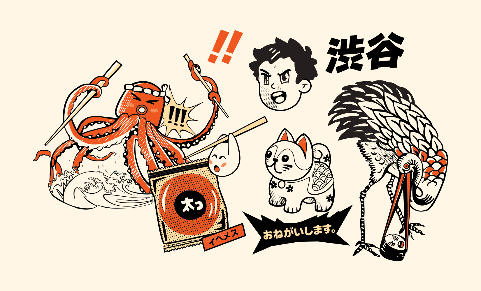
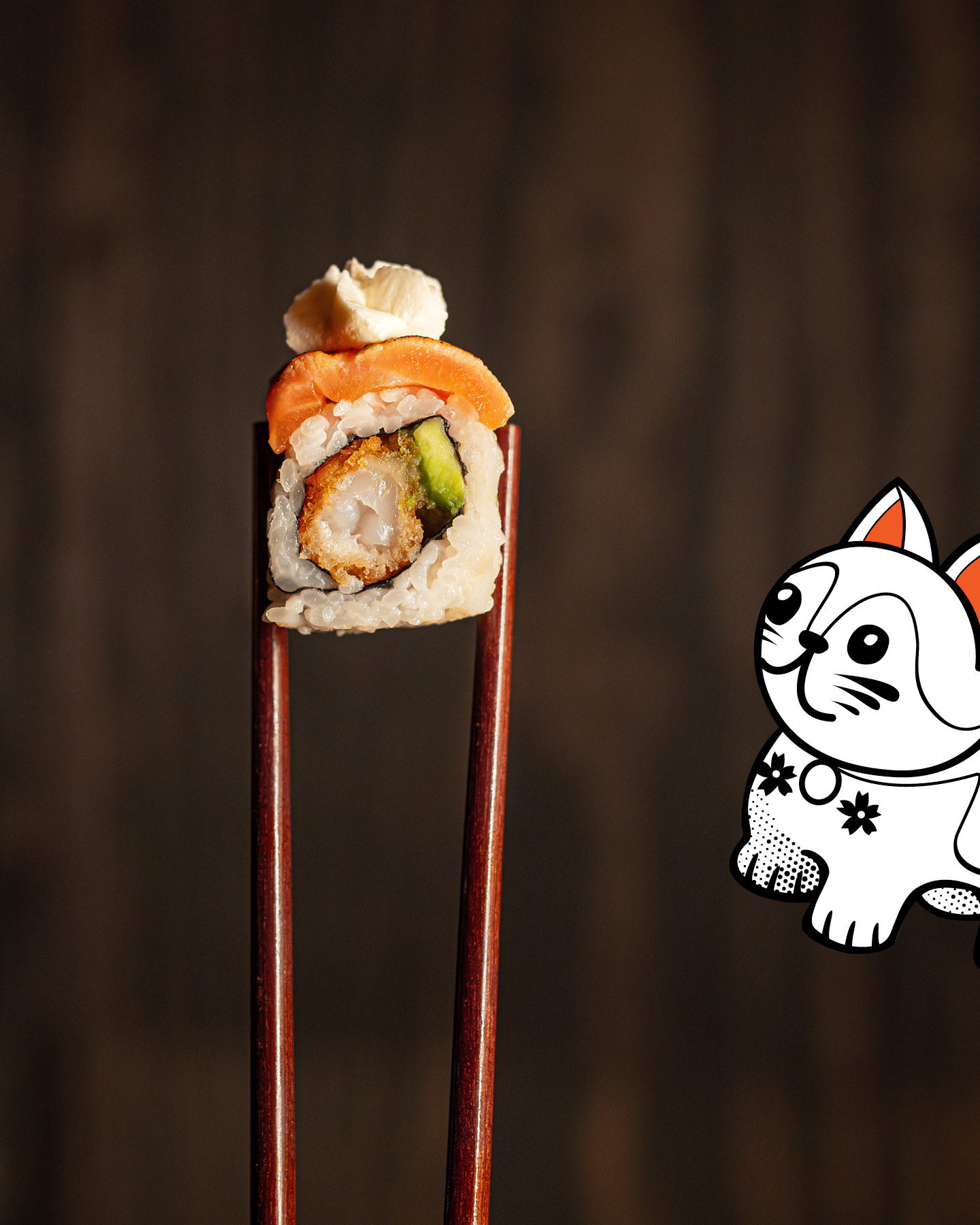
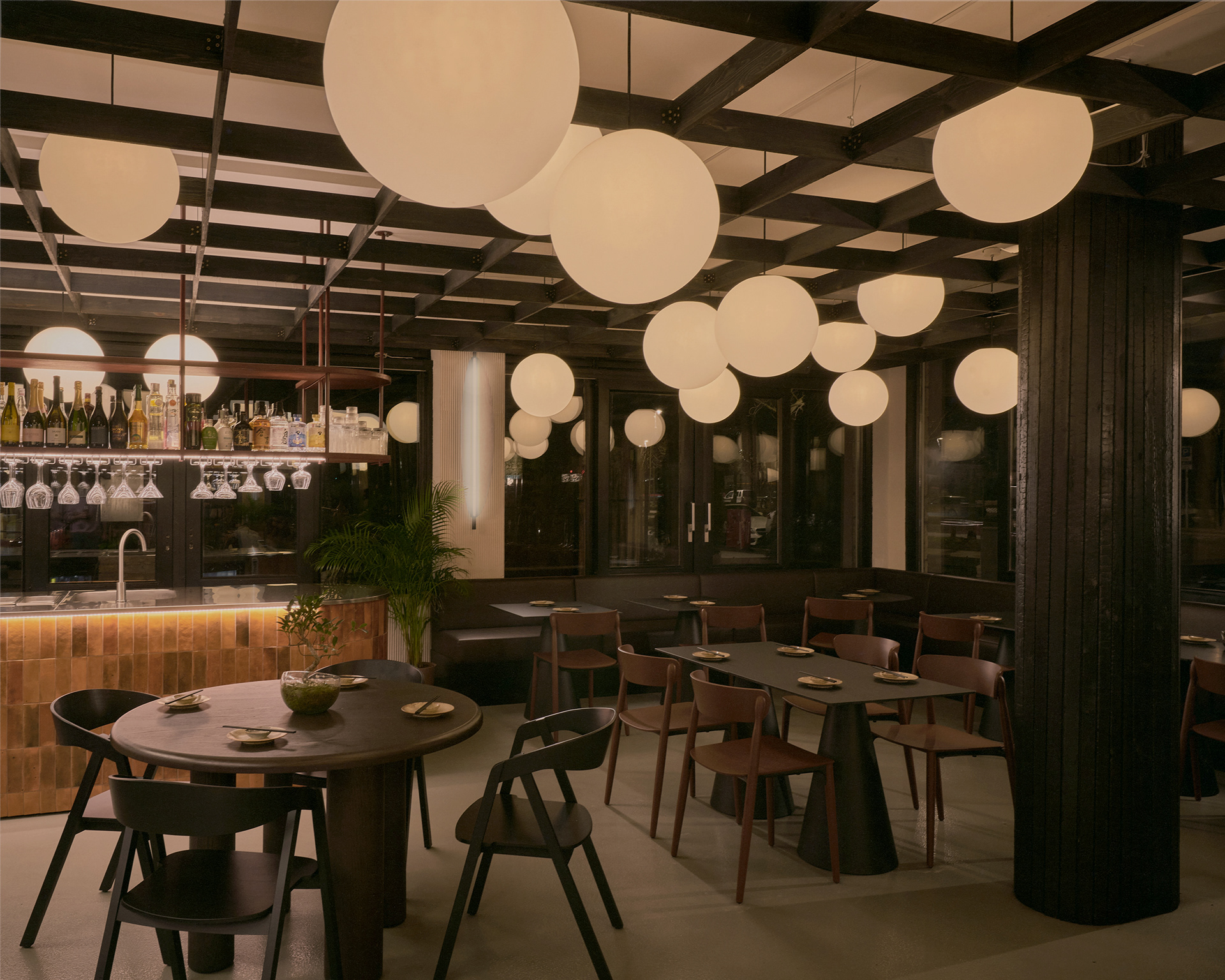
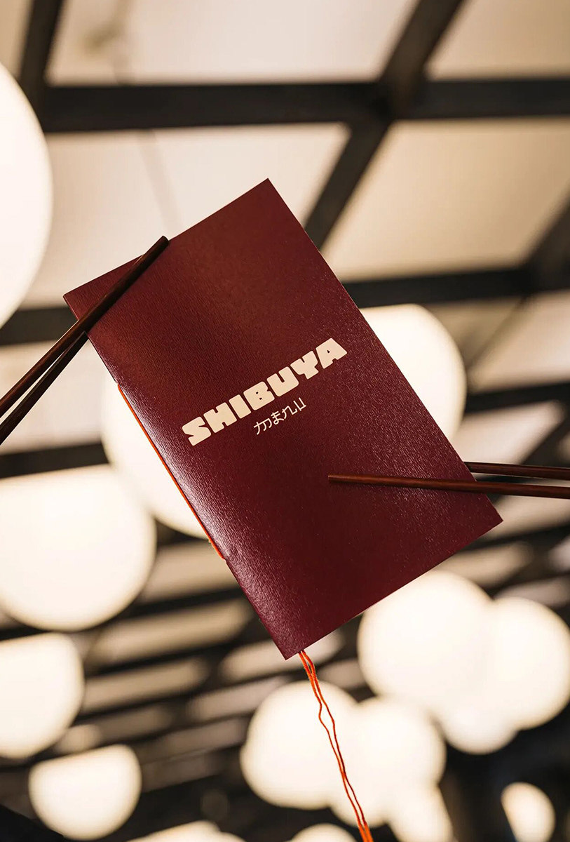
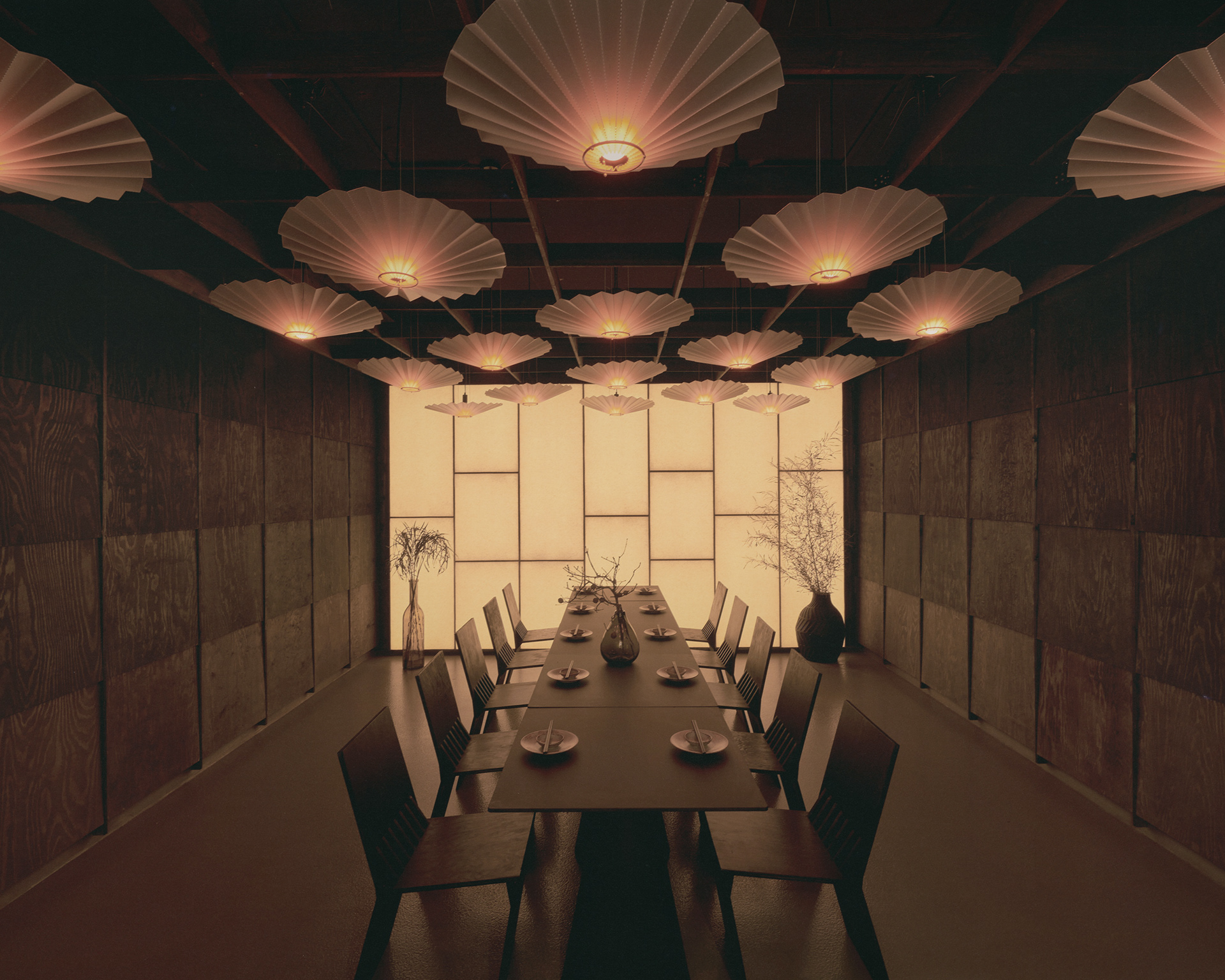
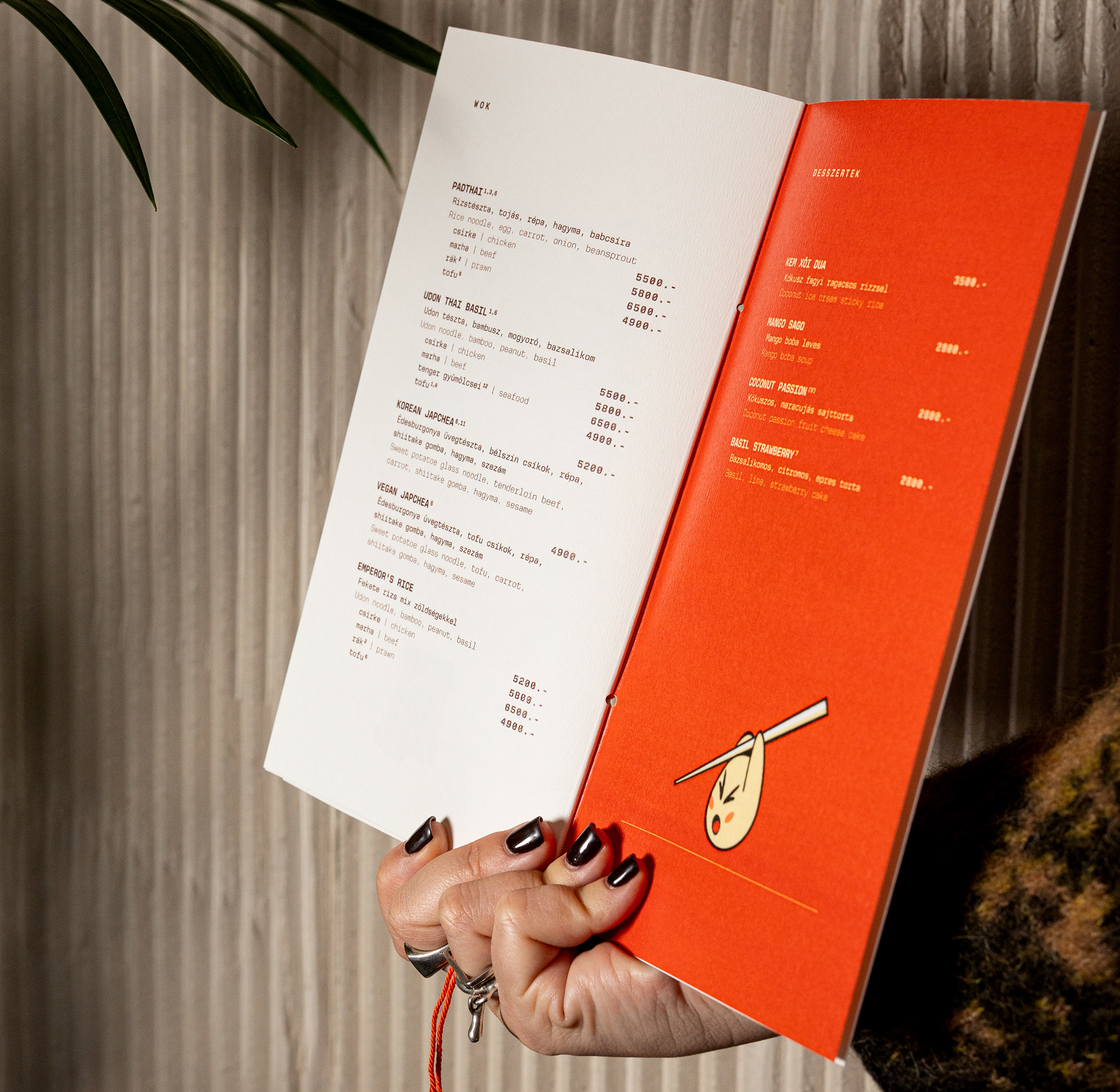
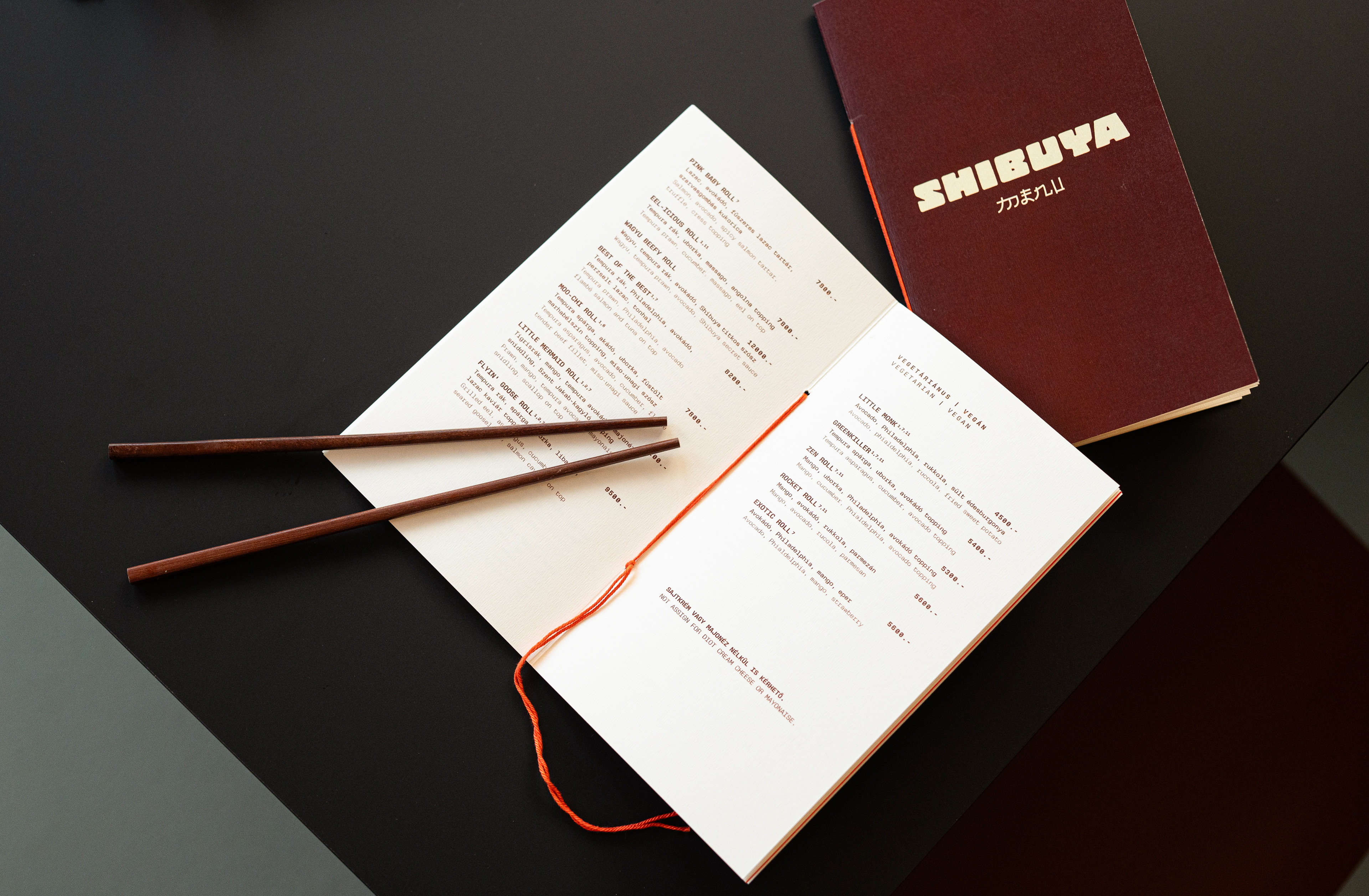
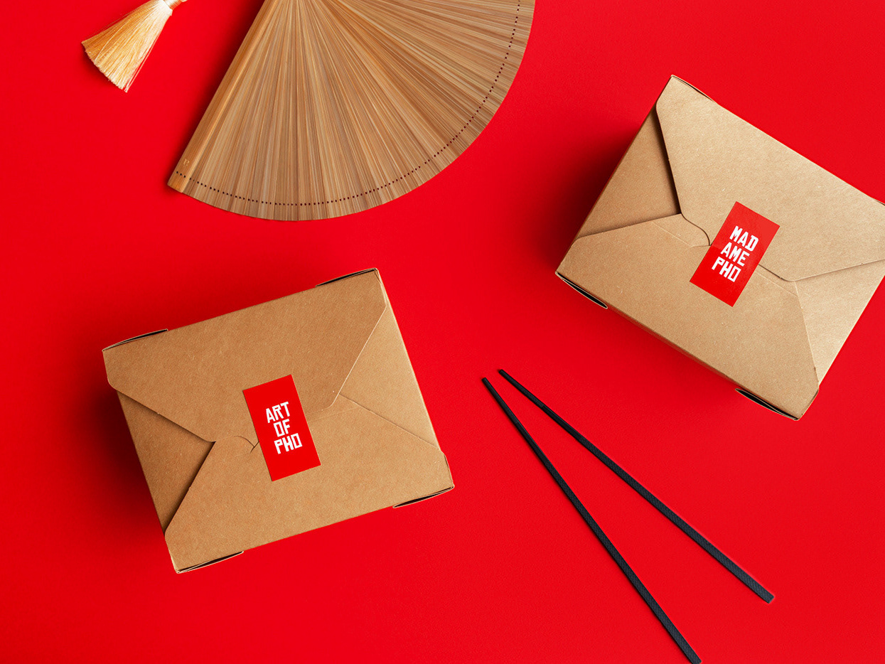
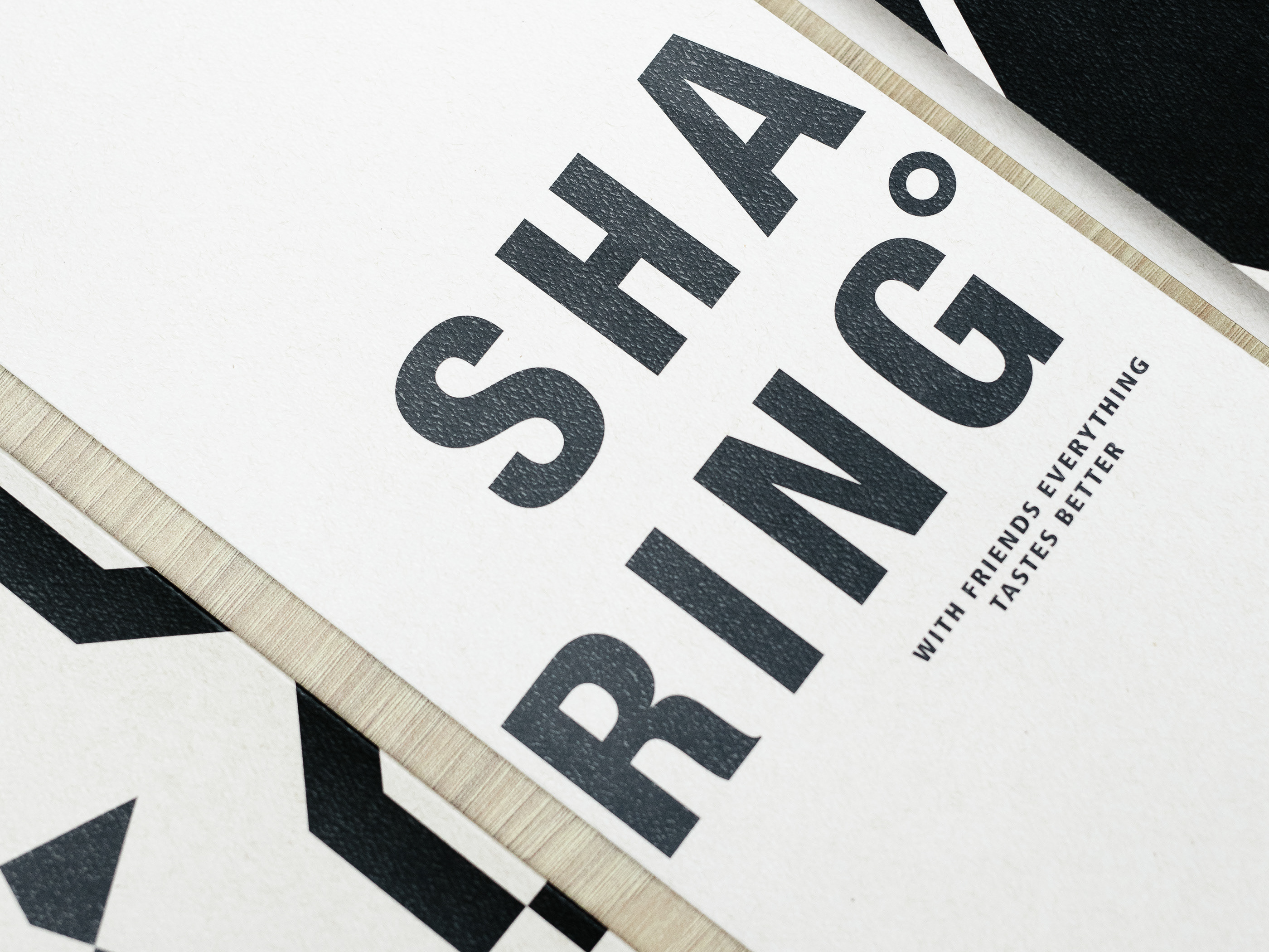
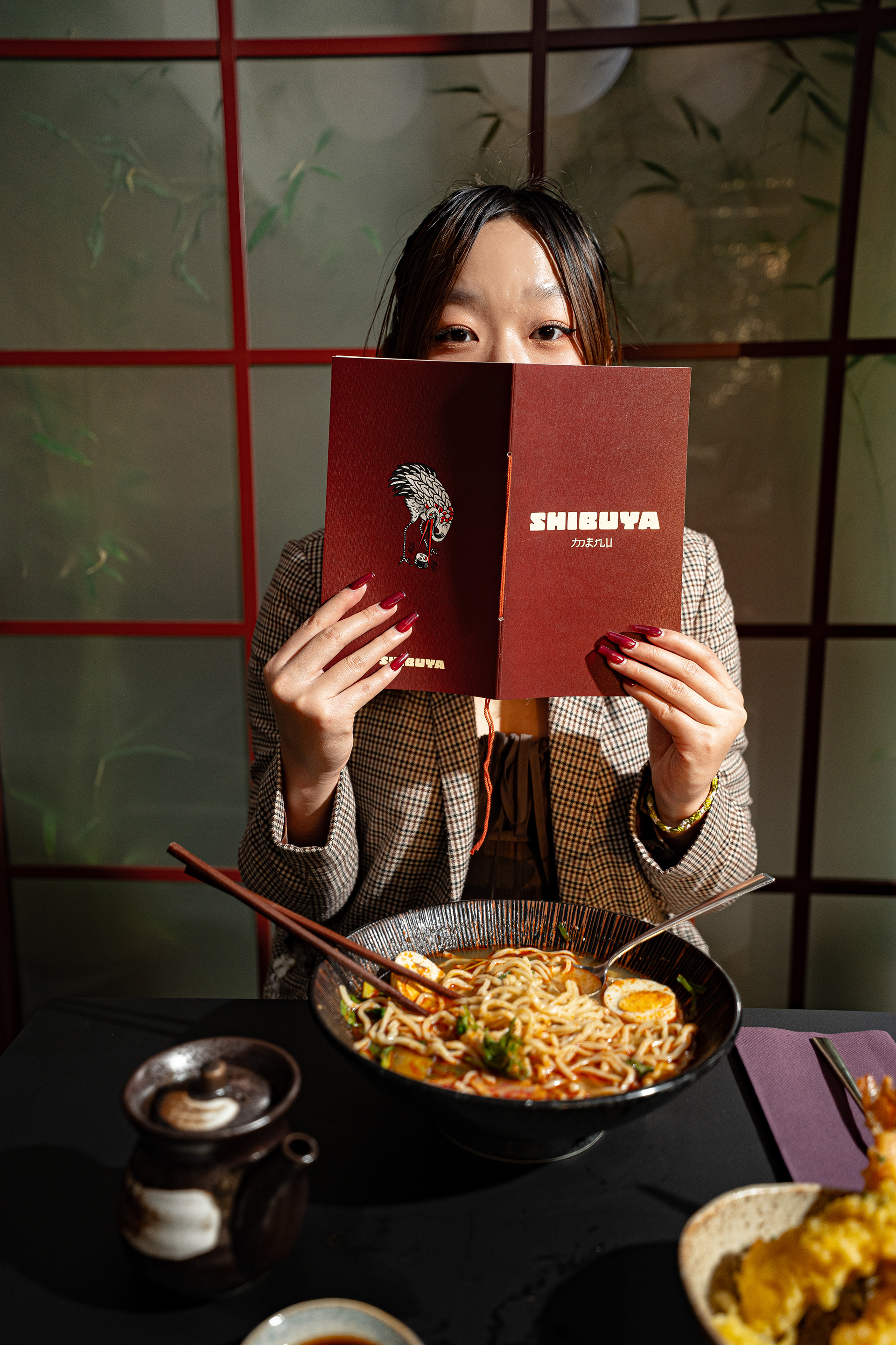
This duality defines the identity. The logotype is block-like, reduced and architectural. In contrast, the extended visual system is expressive and playful: illustrated characters, fragmented scenes, sharp outlines and a limited yet striking palette. The graphic layer acts as a vivid counterpoint to the interior’s dark wood structures and restrained materiality, subtly disrupting the space so that color and visual intensity ultimately belong to the food.
Shibuya is not a literal interpretation of Japan, but an atmosphere, where minimalism meets visual excess.